4. Plotting radargrams
Plotting is often essential to data manipulation quality control. Here are some basic examples of plotting and plot rendering methods.
I give examples below, but you will quickly realize that a lot of radar data requires at least a little bit of a touchup before it looks presentable. That’s covered in the next section, Processing radar arrays. Note that some of the examples below will jump ahead to use methods covered in that section.
Note
I apologize to metric system users. matplotlib uses inches and dots per inch (DPI) and for consistency’s sake I chose to adhere to imperial units for plot size :(
4.1. Basic plotting
4.1.1. Plotting with Python
Plotting in Python just means setting plot=7 or another integer, which represents the vertical size in inches. In this simple example, we use the zero=[233] flag to get rid of the part of the radargram from before the direct wave meets the receiver.
from readgssi import readgssi
readgssi.readgssi(infile='DZT__001.DZT', outfile='0a.png', frmt=None,
                  zero=[233], plot=5)

Whoops! That’s very long and not very helpful on a standard computer monitor. Let’s pretend we’ve read Processing radar arrays and know how to stack arrays horizontally (see Stacking), and let’s also add some gain to this image as well. (Jump to Setting gain)
4.1.2. Plotting with bash
Plotting on the command line is easy. The most basic plotting routine is accessible just by setting the -p flag and specifying a plot height in inches (-p 5). Here, we also use a zero of 233 samples (-Z 233).
readgssi -i DZT__001.DZT -o 0a.png -Z 233 -p 5
Whoops! As you notice in the Python example above, this file is very long, which makes viewing tough on a screen (but may be what you want for figure creation).
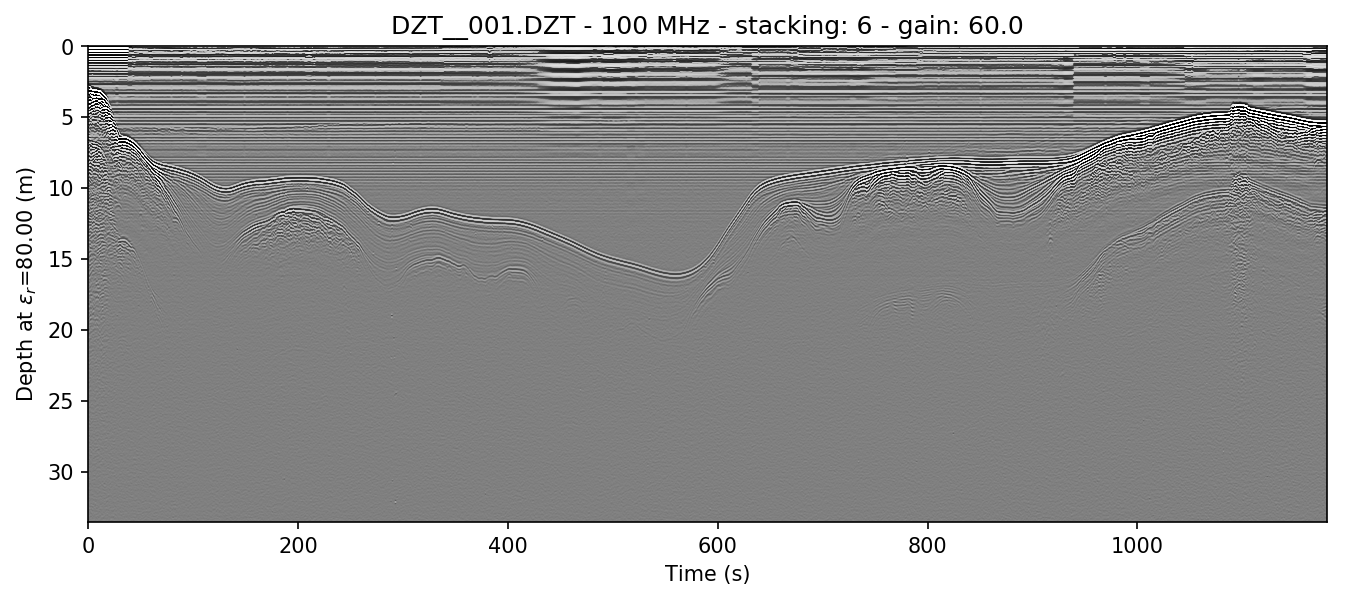
4.2. Setting gain
Gain is added using the gain=int setting. Let’s set that to 60, since this is a lake profile and radar waves attenuate quickly in water. Here, Python and bash examples are given together.
Note
The gain parameter can also be set to a float value between 0 and 1 in order to reduce gain.
Note
This command sets the stacking parameter to “auto”, which is explained in Stacking.
readgssi.readgssi(infile='DZT__001.DZT', outfile='0b.png', frmt=None,
                  zero=[233], plot=5, stack='auto', gain=60)
readgssi -i DZT__001.DZT -o 0b.png -Z 233 -p 5 -s auto -g 60

Wow, looking much better! Now let’s see if we can display depth units on the Z-axis.
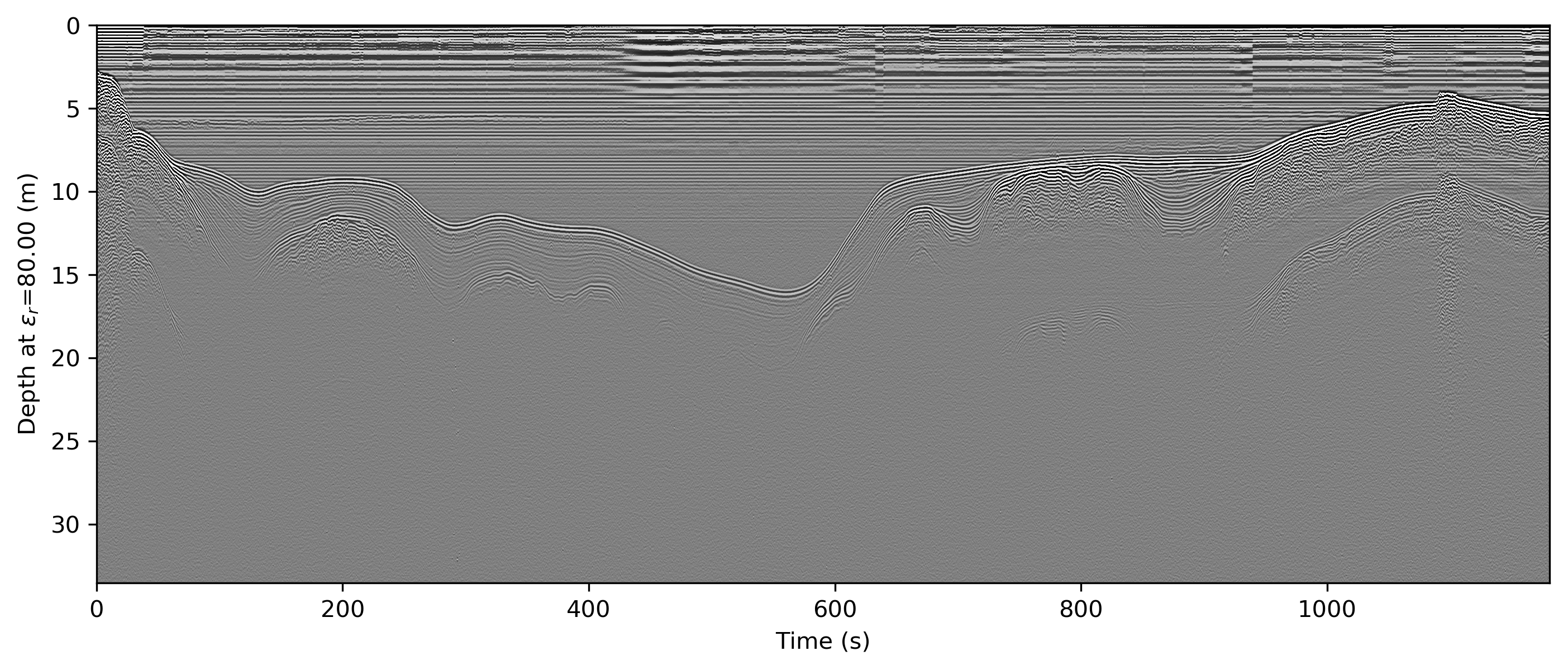
4.3. Changing axis units
4.3.1. Z axis
The Z axis can be displayed in three different unit types: samples, time, and distance. By default, it will display in nanoseconds (ns). The possible values for time display are “temporal”, “time”, “nanoseconds”, and “ns”. Setting the z parameter to “samples” sets the axis to display the number of samples (cells) on that axis.
To set the Z-axis to display material depth, we use two separate flags: epsr=80 or -E 80 — which modifies the wave velocity by setting the dielectric to roughly that of water at 20 degrees C — and z=’m’ or -z m, which sets the z-axis to use those units to calculate profile depths. “m” stands for meters, but you can also specify “meters”, “centimeters”/”cm”, or “millimeters”/”mm” explicitly.
readgssi.readgssi(infile='DZT__001.DZT', outfile='0c.png', frmt=None,
                  zero=[233], plot=5, stack='auto', gain=60,
                  epsr=80, z='m')
readgssi -i DZT__001.DZT -o 0c.png -Z 233 -p 5 -s auto -g 60 -z m -E 80
If you would like to learn how to remove the horizontal noise in the water column of this image, head to Getting rid of horizontal noise.
4.3.2. X axis
Warning
Changing the X-axis units is simple as well, but beware that distance units will not be accurate unless the file is either distance normalized, or was recorded with a survey wheel or DMI and has a proper samples per meter value set. See Distance normalization for more information.
The X axis can be displayed in time, traces, and distance. By default, it will display in seconds (s). To set this to “traces”, which is calculated from the number of samples on the axis prior to stacking, set the x=’traces’ or -x traces flag. See the warning above about setting the axis to distance.
4.4. Making poster-quality figures
Let’s say you are really enamored with the way that last figure looks, and you now want to create a figure-quality image for a poster. You’ll likely want to drop the title (title=False in Python or -T in bash), and increase the DPI to something that will work well on a plotter (dpi=300 in Python or -D 300 in bash). Pretty simple. Let’s see it in action.
Note
I use 300 DPI here to keep file size down, but if you are truly aiming for very high print quality, you may want to increase to 600 DPI to match the capability of most high-end plotters.
readgssi.readgssi(infile='DZT__001.DZT', outfile='0d.png', frmt=None,
                  zero=[233], plot=5, stack='auto', gain=60,
                  epsr=80, z='m', title=False, dpi=300)
readgssi -i DZT__001.DZT -o 0d.png -Z 233 -p 5 -s auto -g 60 -z m -E 80 -T -D 300
4.5. Changing the colormap
By default, the colormap is Matplotlib’s “gray”, which is intended to emulate RADAN’s default.
Changing colormaps is as simple as specifying a valid matplotlib.colors.Colormap to use. For a list of valid colormaps, see the Matplotlib documentation. A popular alternative is “seismic”, a diverging blue-white-red colormap used often in sub-bottom seismic surveying.
readgssi.readgssi(infile='DZT__001.DZT', outfile='0e.png', frmt=None,
                  zero=[233], plot=5, stack='auto', gain=60,
                  epsr=80, z='m', title=False, dpi=300,
                  colormap='seismic')
readgssi -i DZT__001.DZT -o 0e.png -Z 233 -p 5 -s auto -g 60 -z m -E 80 -T -D 300 -c seismic
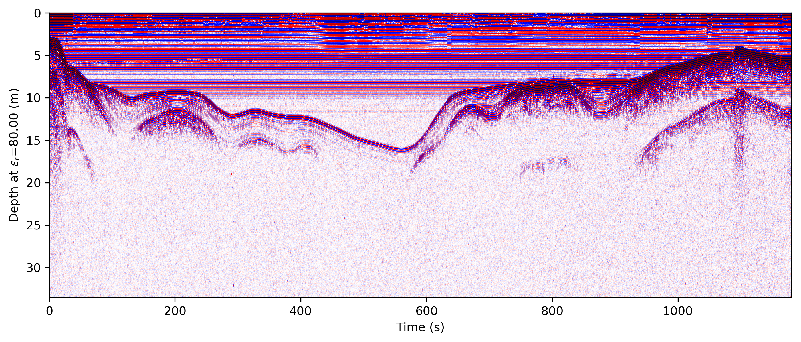
Changed in version 0.0.16: The default colormap was changed to “gray”, because of a previously unnoticed polarity switch in the previous default “Greys”.
4.6. Suppressing the Matplotlib window
By default, the matplotlib GUI window will display upon successful execution and saving of the radargram, so that you can modify titles and other plot features. To suppress this behavior, set the noshow=True or -n option.
Because the program will wait for the closure of the Matplotlib window before continuing, this flag is useful for processing folders full of files in bash without user attention.
Note
If plotting is on, readgssi will always save an image, regardless of whether or not the Matplotlib GUI is set to show up. I have found that this behavior makes it easier to save files under the same name but with title and axis label modifications.
This is especially useful when the outfile parameter is not set, and the program uses the readgssi.functions.naming() function to set complex but informative filenames. When saving from the Matplotlib window, click the save button, navigate to the file just saved by the program, then single-click the file name. The save dialog will auto-populate the filename and you can overwrite without the hassle of copying and pasting.